Atomeca
Brand Identity
Creating the brand identity for a new bistro based within Manchester's iconic Deansgate Square.
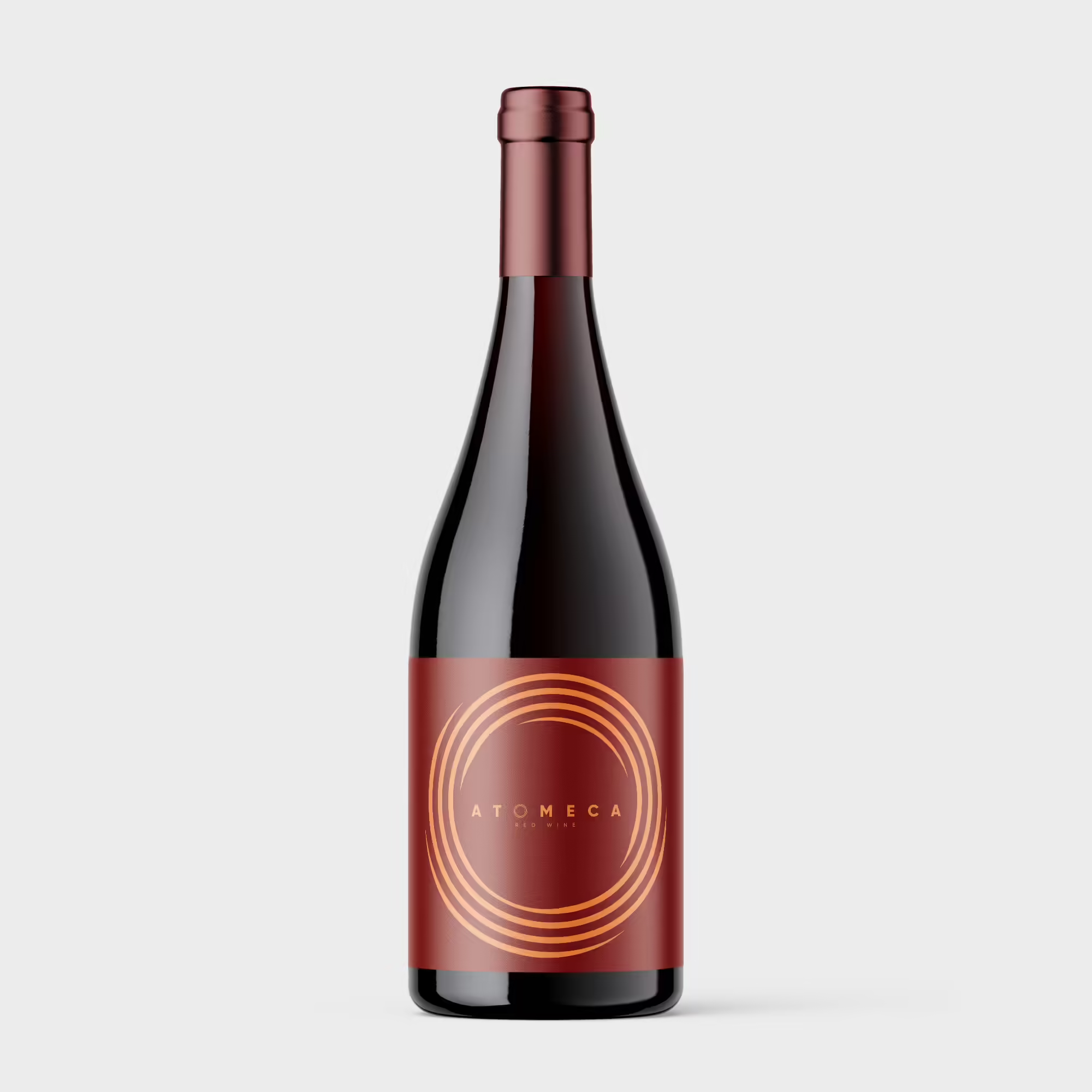
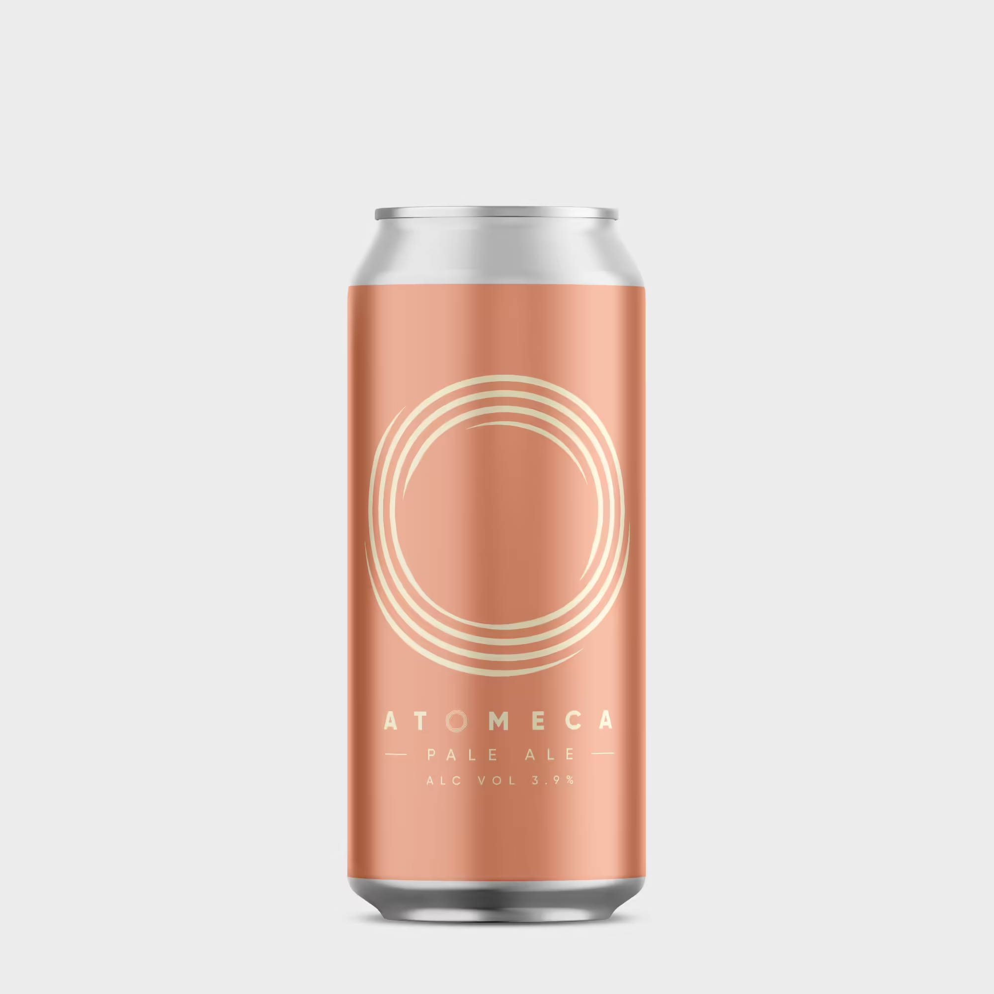
Inspired by Manchester's history as the place where the atom was first split, the brand mark is a stylised representation of the spinning electrons found around every atom's nucleus.
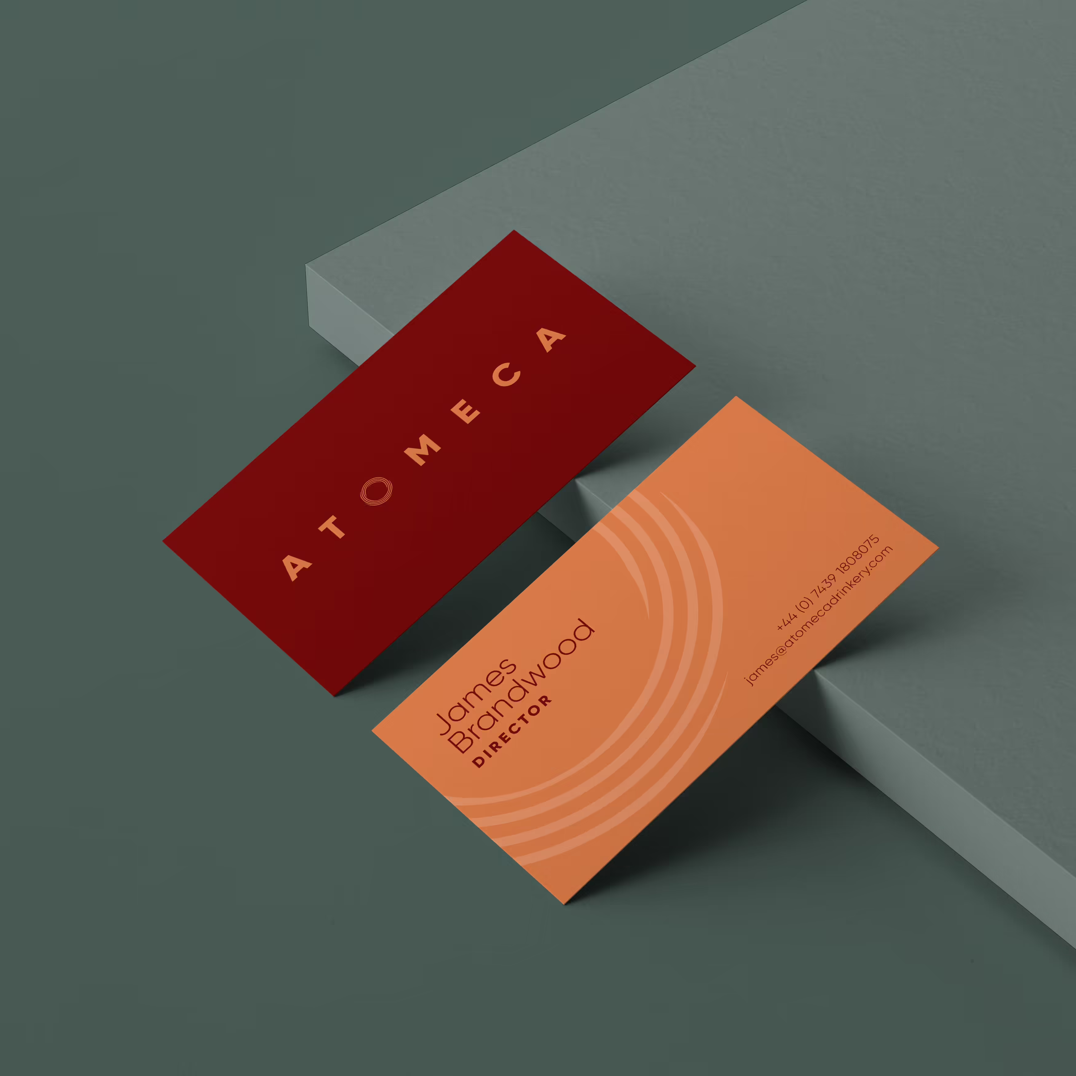
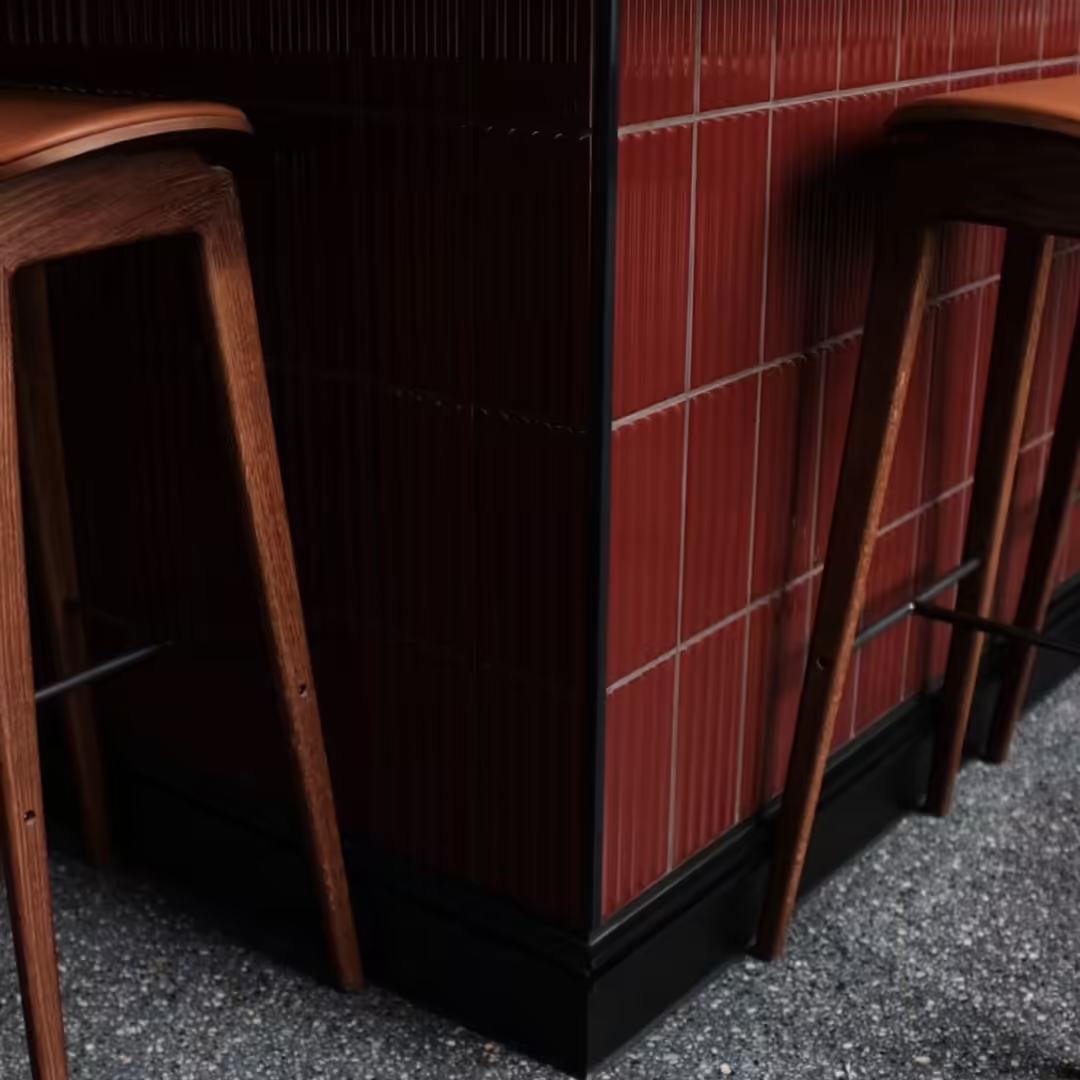
The brand colour palette comprises six tones, each influenced by Manchester's industrial architecture.

The brand colour palette formed the basis for the selection of materials that were used throughout the internal decoration.


The brand typeface was curated to have the feel and heft of a heritage typeface whilst retaining a fresh and modern look.
The brand system was carried through to Atomeca's own label wines and beers.