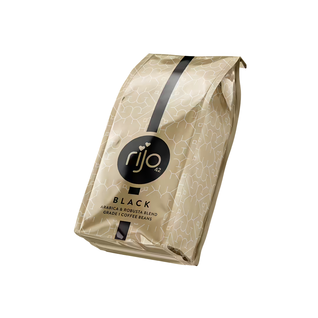
Rijo
Brand Identity Refresh
Refreshing the brand identity for one of the UK's largest commercial coffee retailers.
Rijo wanted to freshen up their brand identity whilst still retaining the existing brand essence.
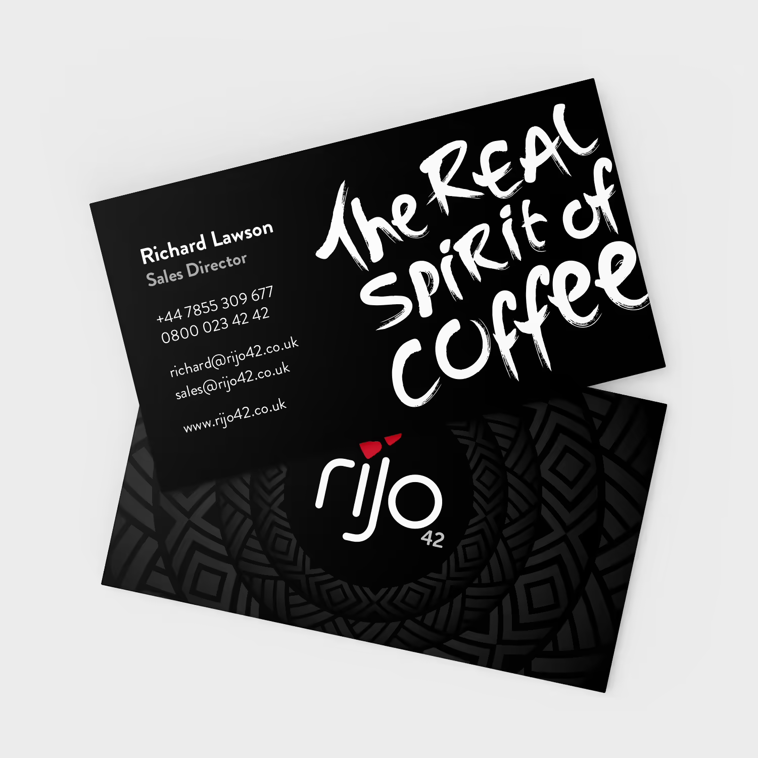
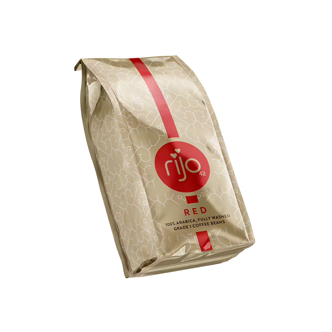
The brand logo was given a fresh new look by removing the serifs and creating a better balance, allowing it to be placed inside a roundel.
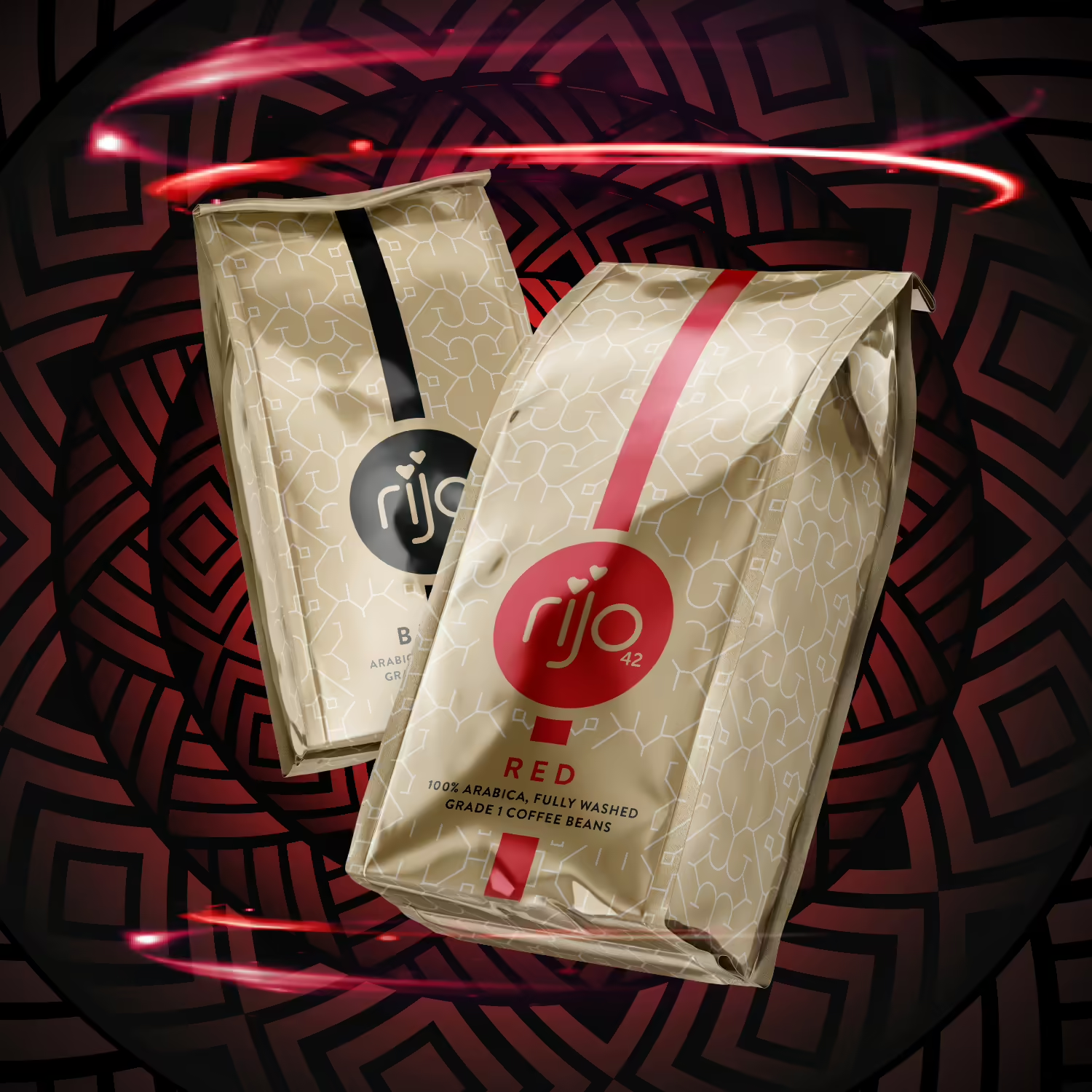
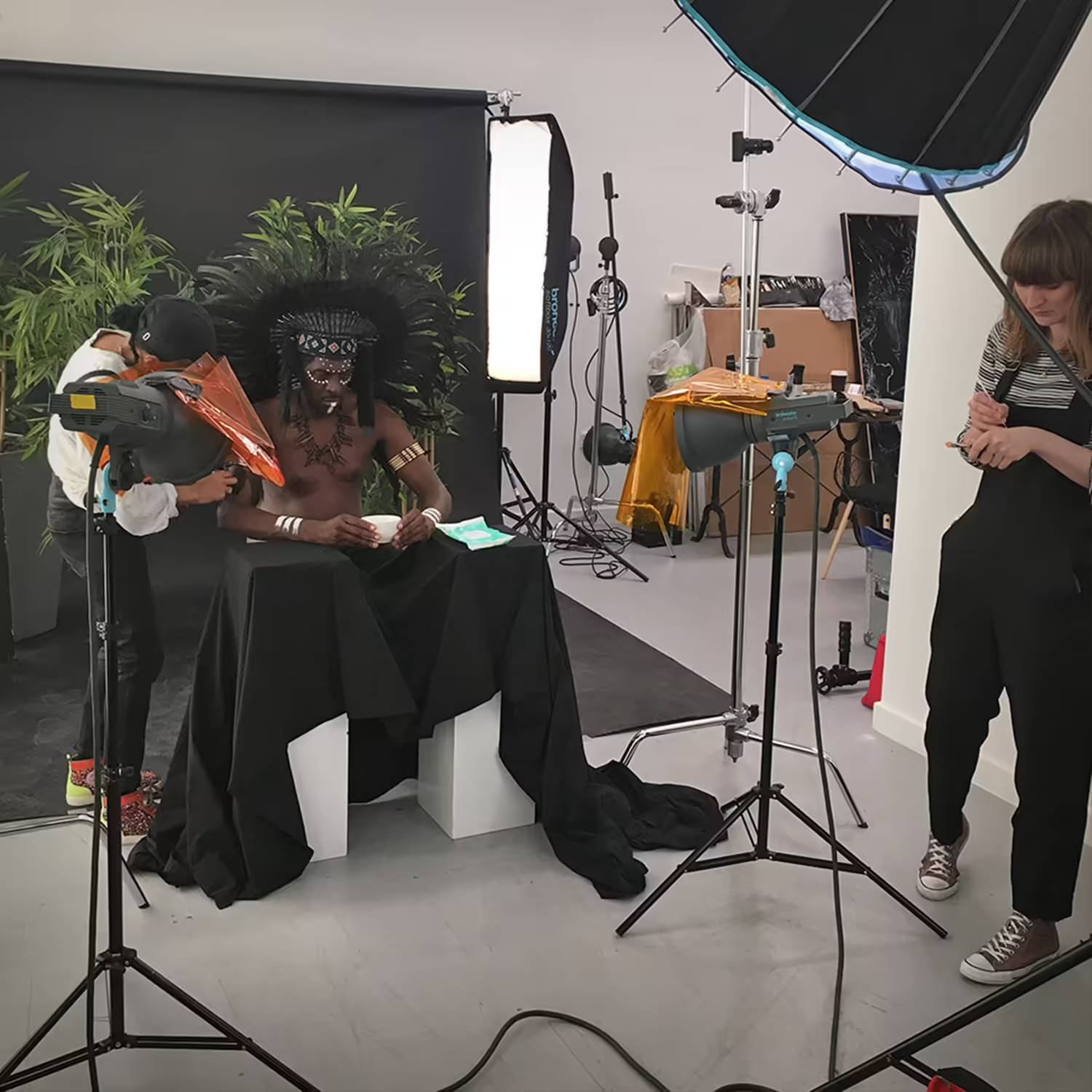
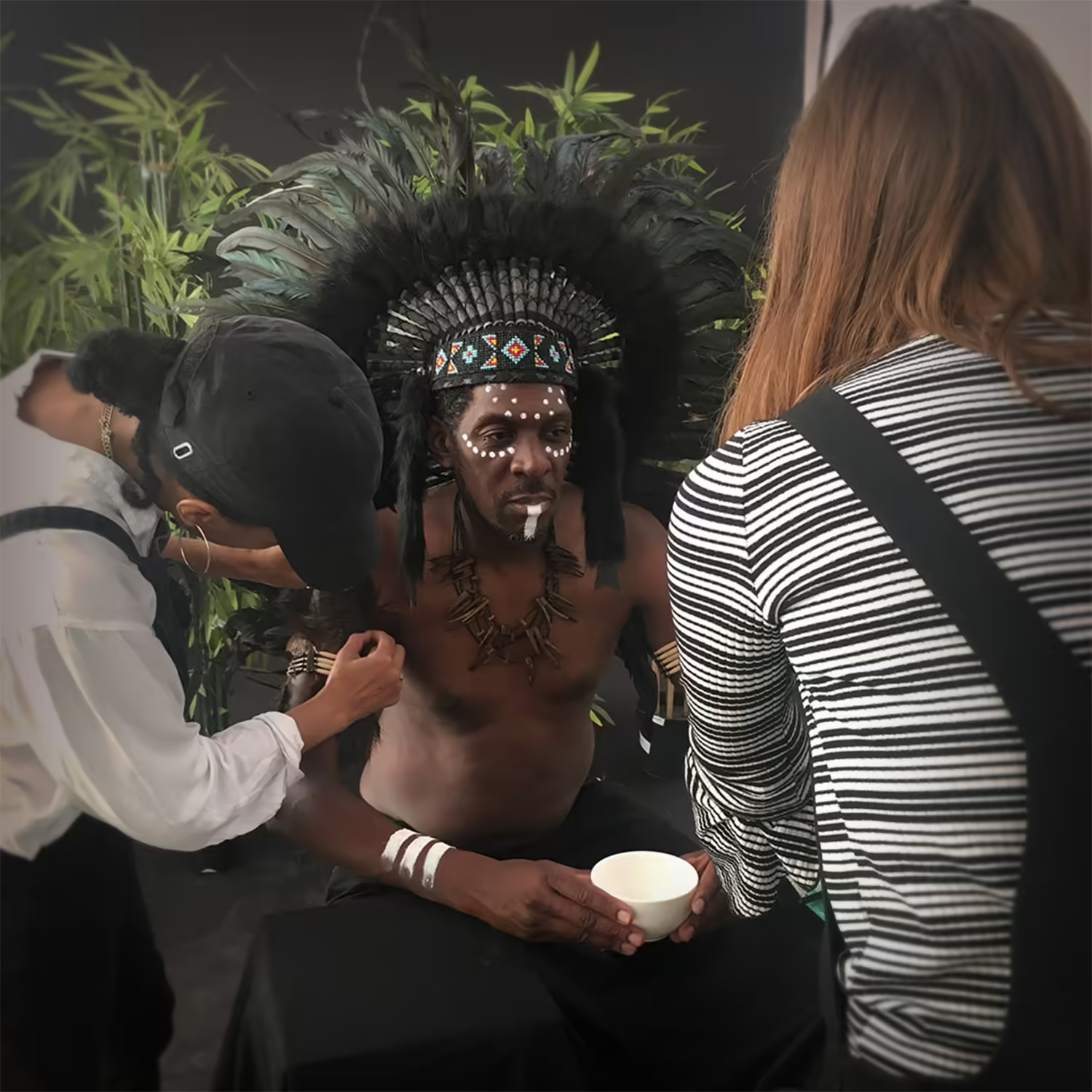
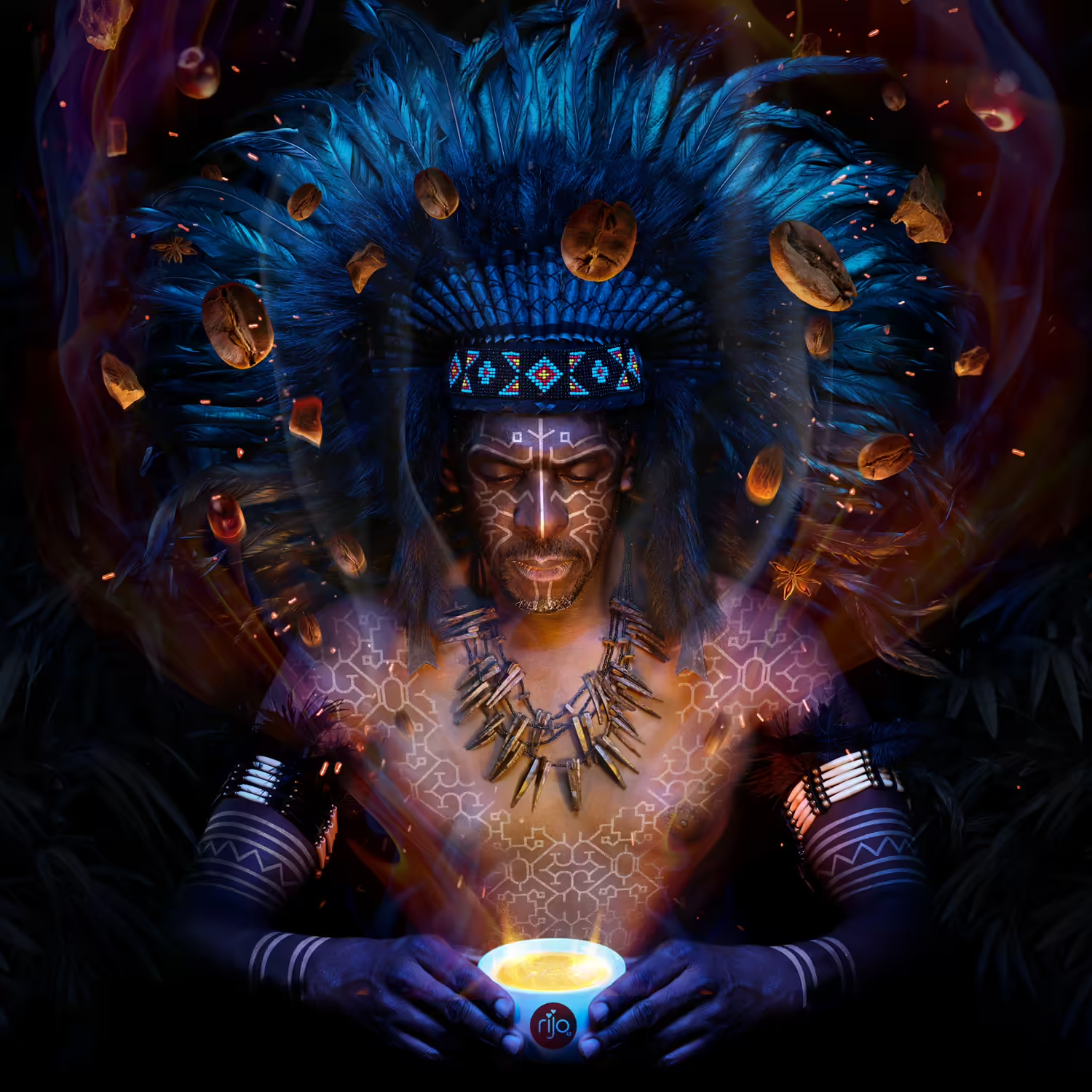
The new packaging design was inspired by the tribal markings of the indigenous peoples of Peru where most of the coffee beans are harvested.
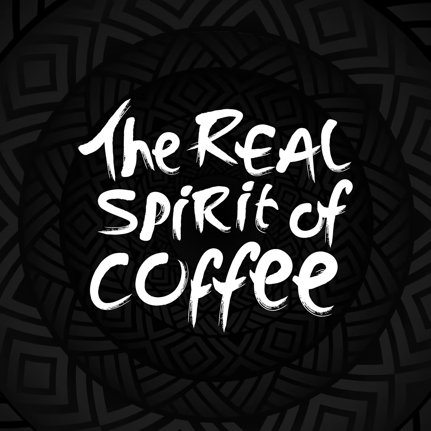
The visual look of brand strapline was re-treated to have a raw, visceral feel allowing it to be used on its own without always accompanying the logo.
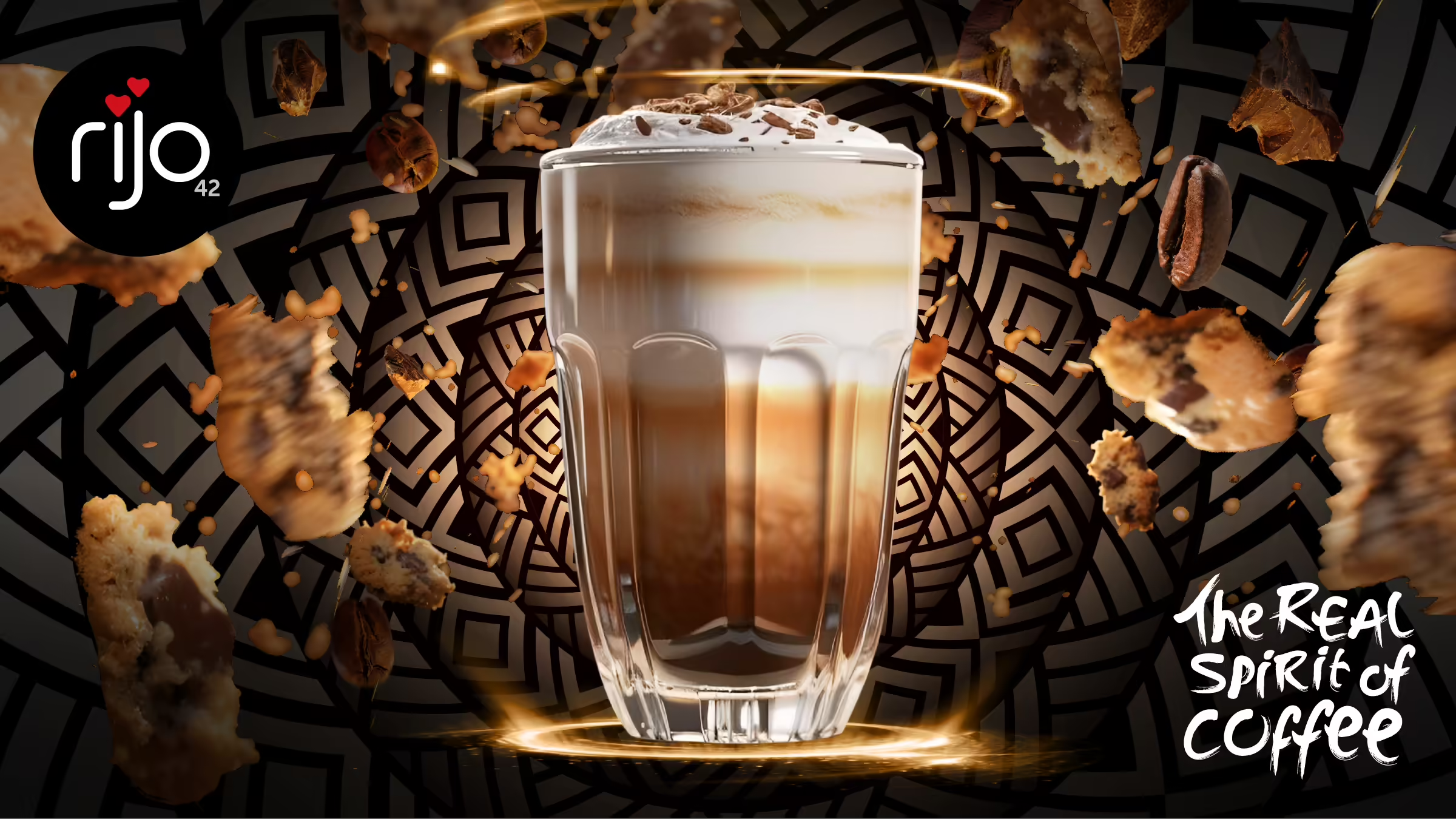
The overall brand design system included assets that could be composited and used in social media posts.


All assets were made available in Canva, enabling the client to make high impact, on-brand social posts in-house without the need for an external design agency.