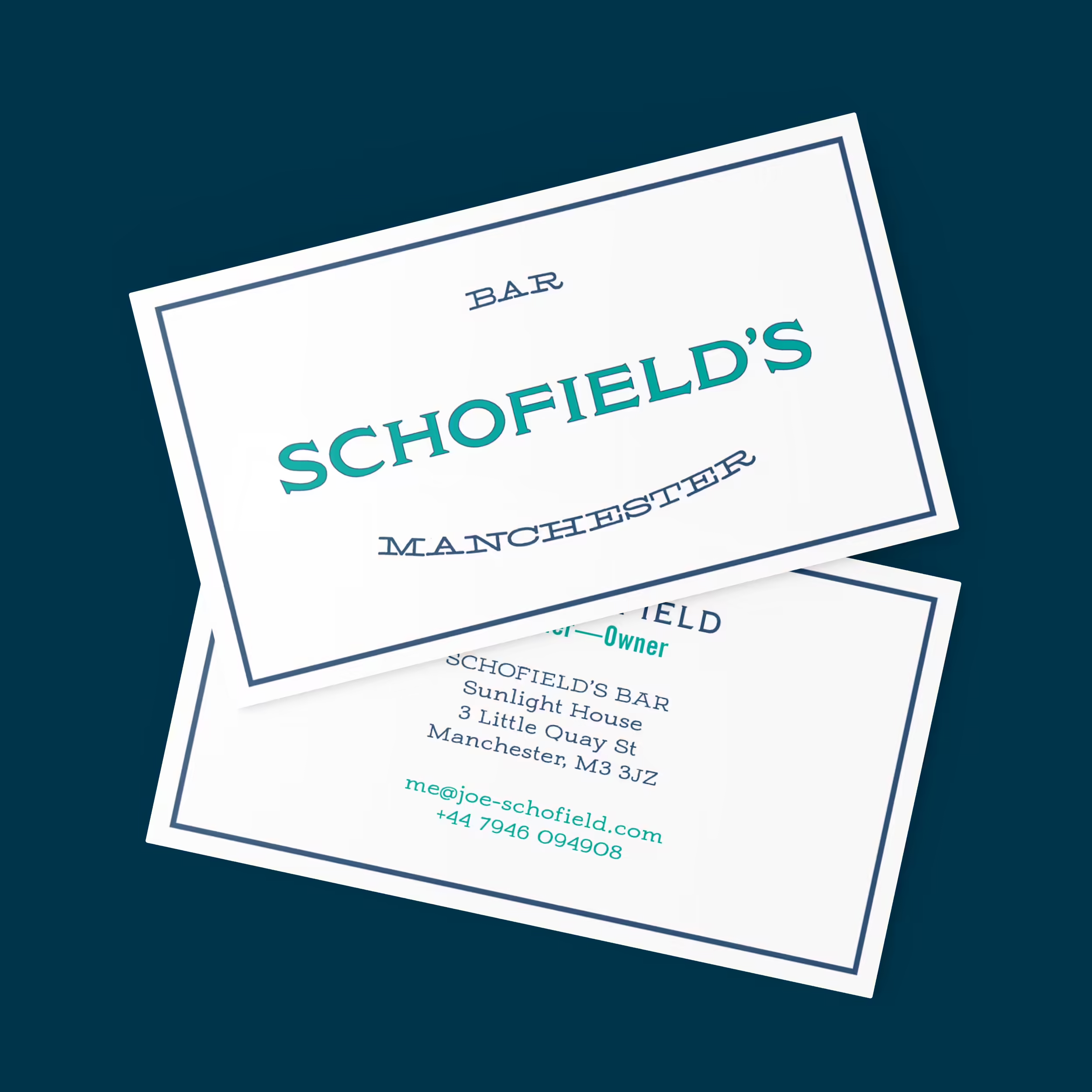
Schofield's Bar
Branding
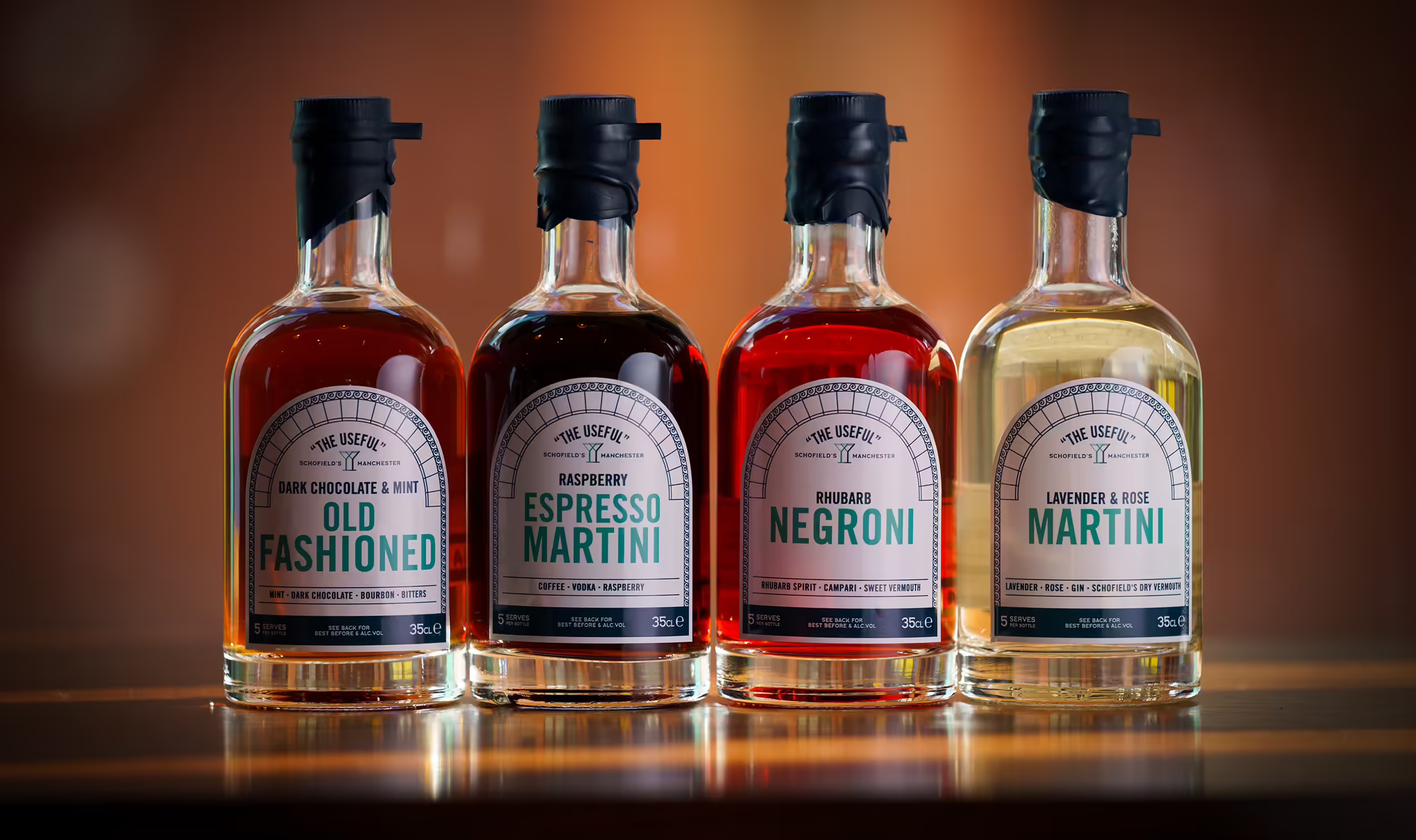
Graphic design and typesetting for the UK's best cocktail bar.
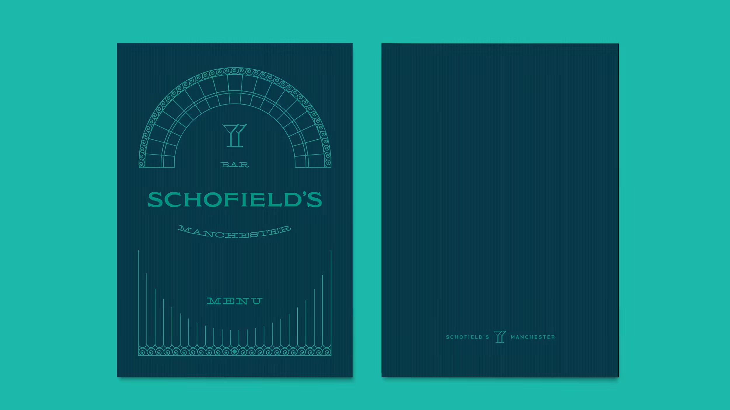
The overall look has a heritage feel harking back to the Art Deco design of the building where the bar is located.
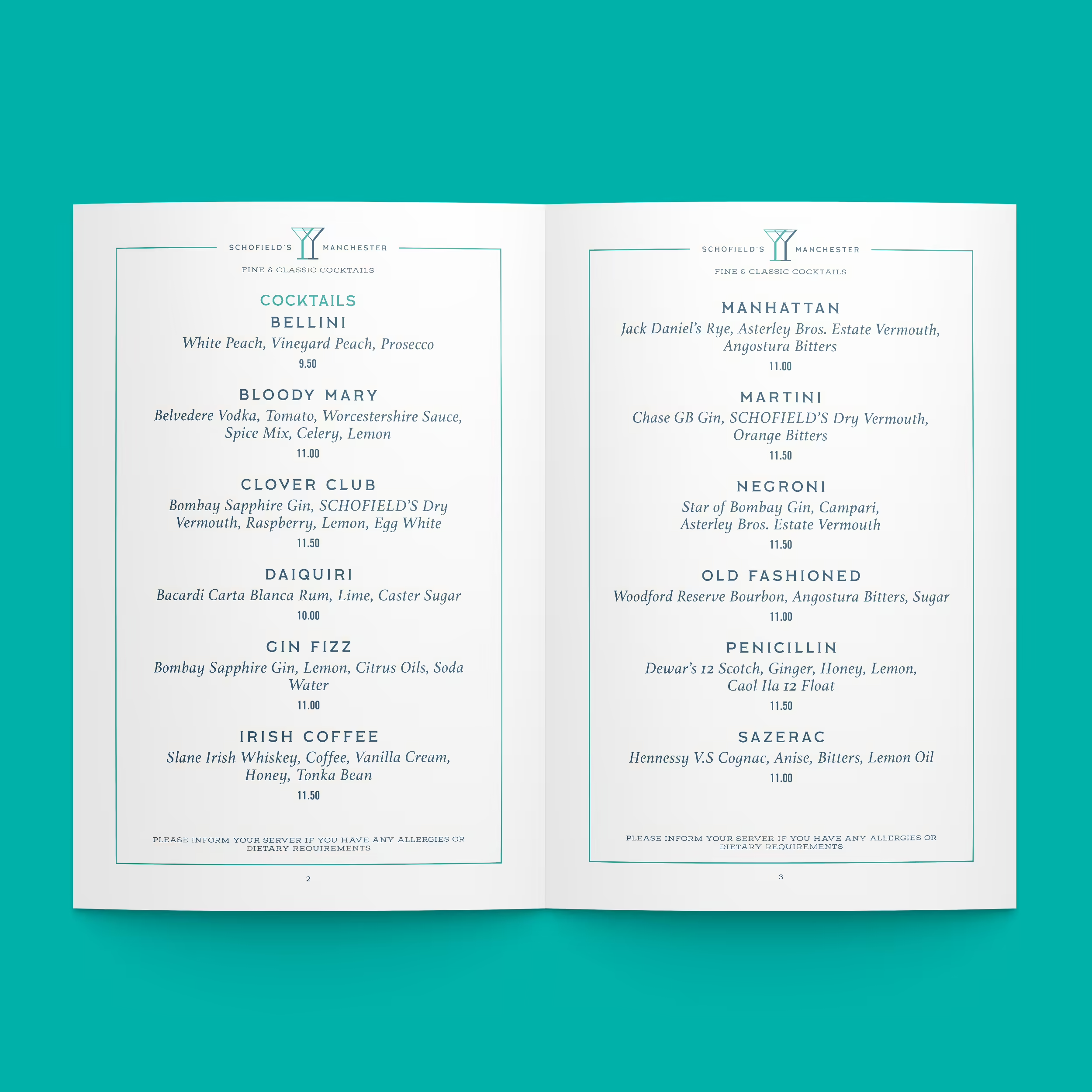
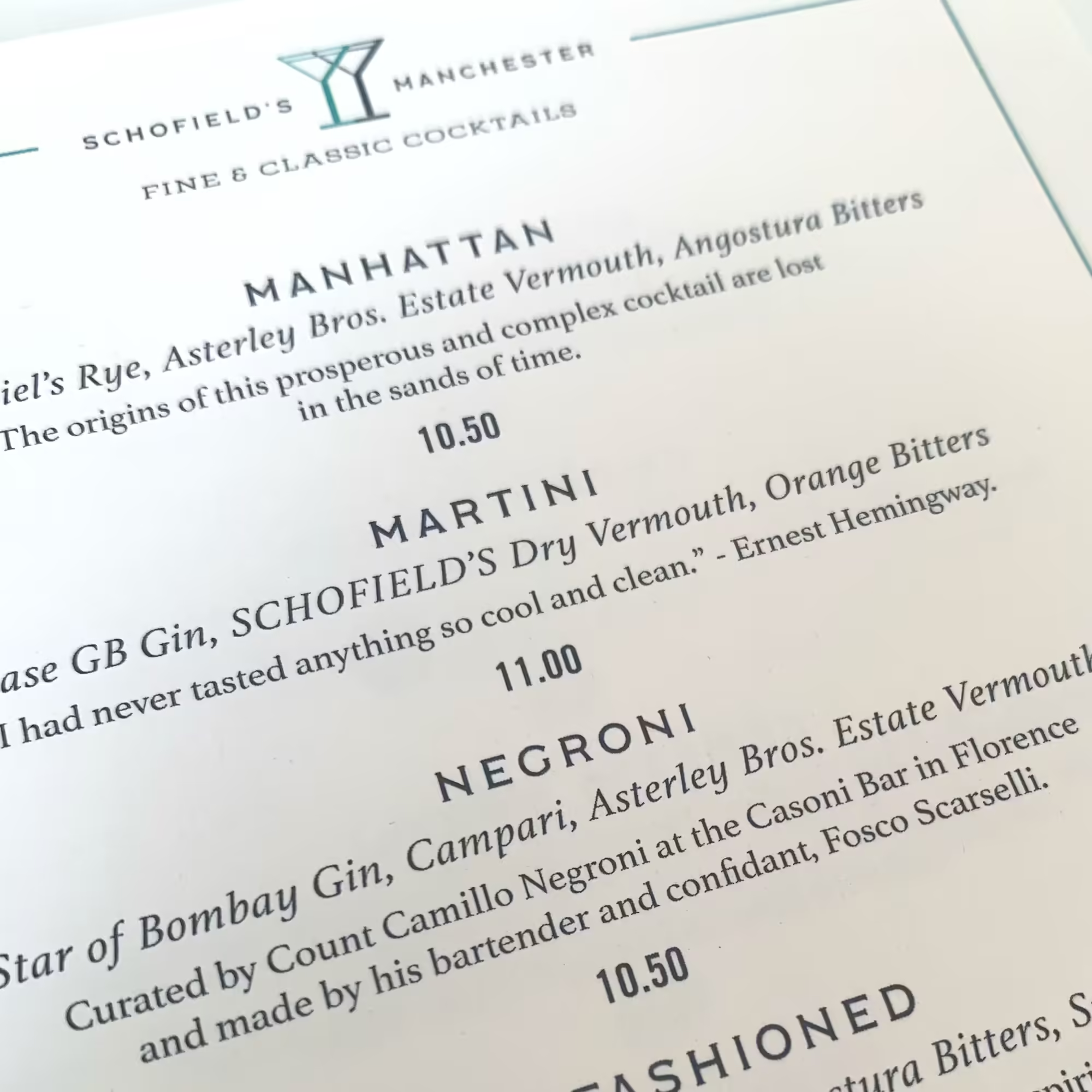
The type hierarchy for the menus was intended to create a feel reminiscent of letter press printing.
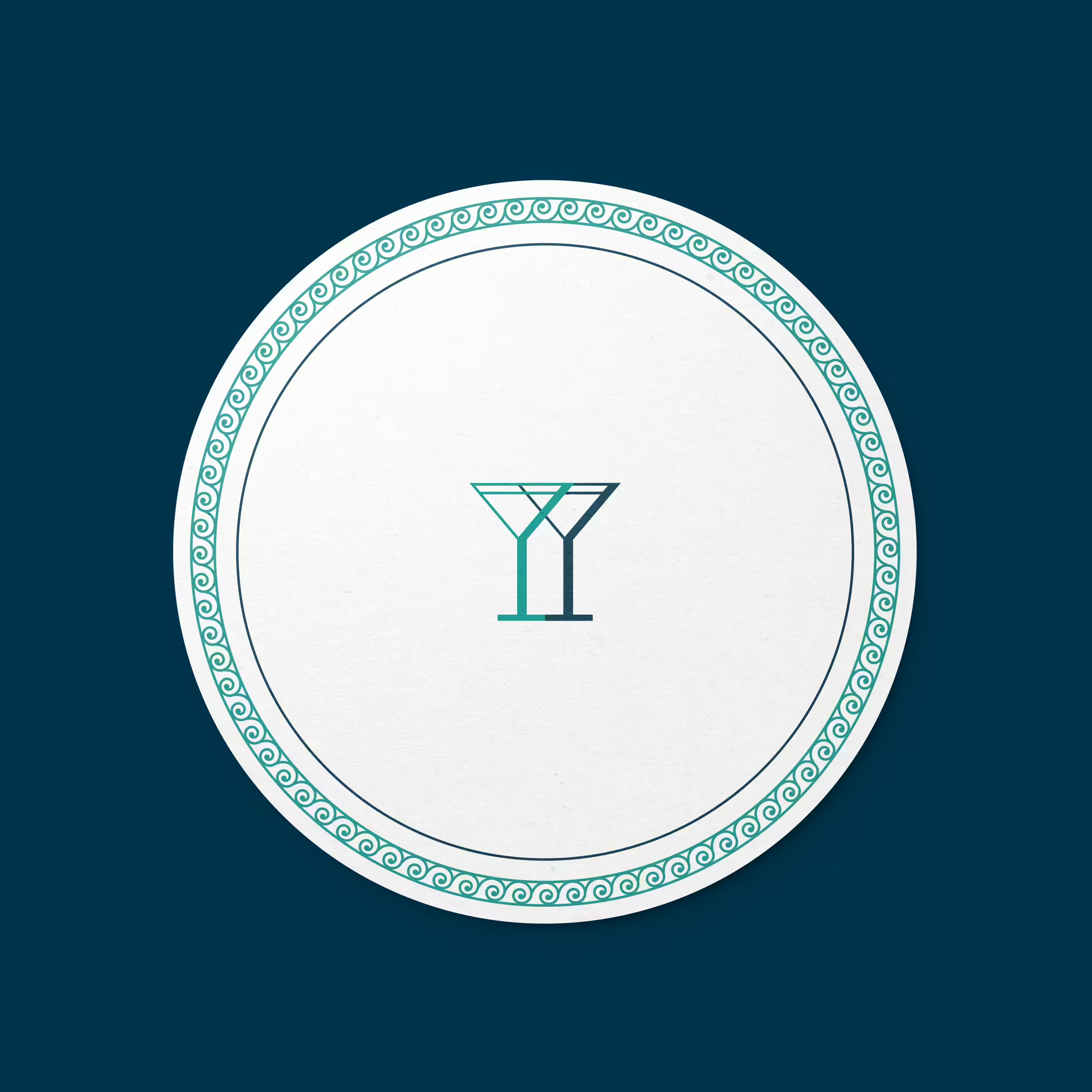
The archway of the building is a key motif that appears in stylised form across multiple elements.
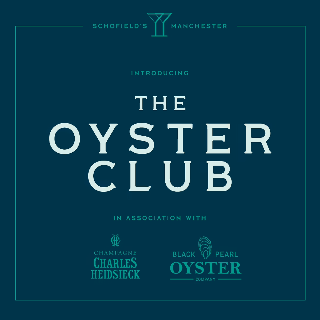
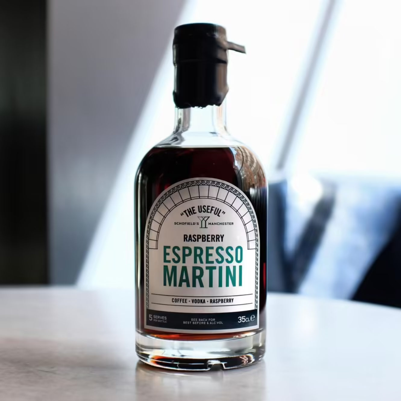
Art direction for all social communications ensures a heritage accent with a clean and modern feel.